
The design committee behind Paris 2024 revealed on Wednesday 8 February 2023 the new sports pictograms for the Games, among several other ideas for the all-important visual presentation.
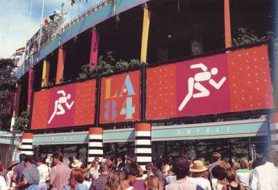
There are now only 18 months to go until the opening ceremony for Paris. The revelation of the pictograms (sounds like a prog-metal album track) is a key ritual stage in the gradual unboxing of ‘the look’; that much pored-over and fretted-about, committee-driven palaver that is the overall design and visual communication of each Games – and most importantly, what it’s going to look like on TV.
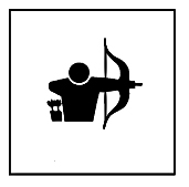
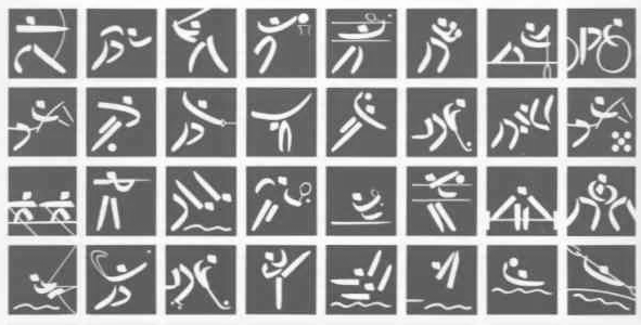
A few years ago I wrote a very long and detailed post discussing every pictogram for Olympic archery ever. You can read that here: Olympic archery pictograms through the ages. Here’s the full set of 47 for Paris:
Pictograms, according to the usual online source, are “graphic symbols that convey meaning through pictorial resemblance to a physical object.” This can include things as simple as a warning sign, or something more artistic.
Pictograms in an Olympic context were first used in 1964, but by far the most famous and influential set was made by designer Otl Aicher in 1972 for the Munich Olympics, and reused again four years later. Aicher used a standard set of design elements for heads, arms and legs and in doing so, created design systems. The vast majority of Olympic pictograms since have been based in some way on Aicher’s work, and many other forms of signage too. Aicher literally changed the way we see the world.
But the essential quality of pictograms, and the reason they were used in an Olympic context in the first place, is to communicate across language barriers. You could speak precisely no French (in this case) or English, but because of a little stick man pictogram and an arrow symbol (also a pictogram) you still know that the swimming is this way out of the Chardon Lagache subway station or this ticket is for badminton at 3pm. (Perhaps more importantly, it helps reassure.)
In the pre-internet age, these things were not unimportant. In 2023 the representative-at-a-glance tradition seems to finally have been retired.
These days, the pictogram is a recherche and mildly nostalgic Games design hurdle that nevertheless remains a very public part of the overall branding. Like most good design, you might not really ‘see’ it, but you will feel it.
So the latest designs were rolled out with a whizzy presentation and a lot of pontificating. I quite like the simplicity of the muted pastel blue shaded tones and the ‘paving stones’ grid effect, as shown above, even if it isn’t exactly earth-shatteringly new design-wise. The brand director, Julie Matikhine, expounded thus:
“Combining sport and style is the graphic signature of Paris 2024… Our visual concept is based on a play on words: ‘Sous les pavés, les Jeux’ [‘Under the paving stones, the Games’].” The line is a take on ‘Sous les pavés, la plage!’, one of the many inspirational and provocative slogans seen during the Paris protests of May 1968. “It’s a way to express our revolutionary attitude, but also a way to tell the full story. In France, in every city and village, our streets have paving stones. They’re a symbol of our heritage,” explains Matikhine. “These paving stones are the basis of our system. A paving stone is a square and using this simple shape we can build lots of things.”
I can’t help feeling that any self-respecting Mai ’68 rioter hearing that would have put a brick through the windows of the media room right then and there. It screams justification after the event. By the way, Mai 68 also had its own graphic design iconography, which they seem to be giving the swerve:
According to Inside The Games:
For what organisers claim will be the first time, each different venue will be able to customise the main branding scheme. For instance Marseille, the sailing venue and receiving city for the Olympic Flame, will have the same basic branding but with a different look to Paris.
This is, of course, complete bollocks, as any student of Olympic history who has seen any of the design work for Tallin 1980, the sailing venue for the Moscow Olympics, will tell you. ItG also quoted an unnamed organiser source saying:
“We are obsessed with the idea of innovation, creating experiences and emotions that have not been done before… So we bring together components that are not mixed before – it is a cultural revolution and it will offer something unexpected… The look of the Games is not bizarre – you have the impression that it has always been there.”
There was much more in this vein, but I’m really not sure I’d describe anything as a cultural revolution that wasn’t actually a cultural revolution, for all kinds of humanistic reasons. The main Games logo of Marianne – which I think is absolutely brilliant – is a nod to the French Revolution. So that’s three references to three different violent revolutionary epochs in history. Quite the introduction.
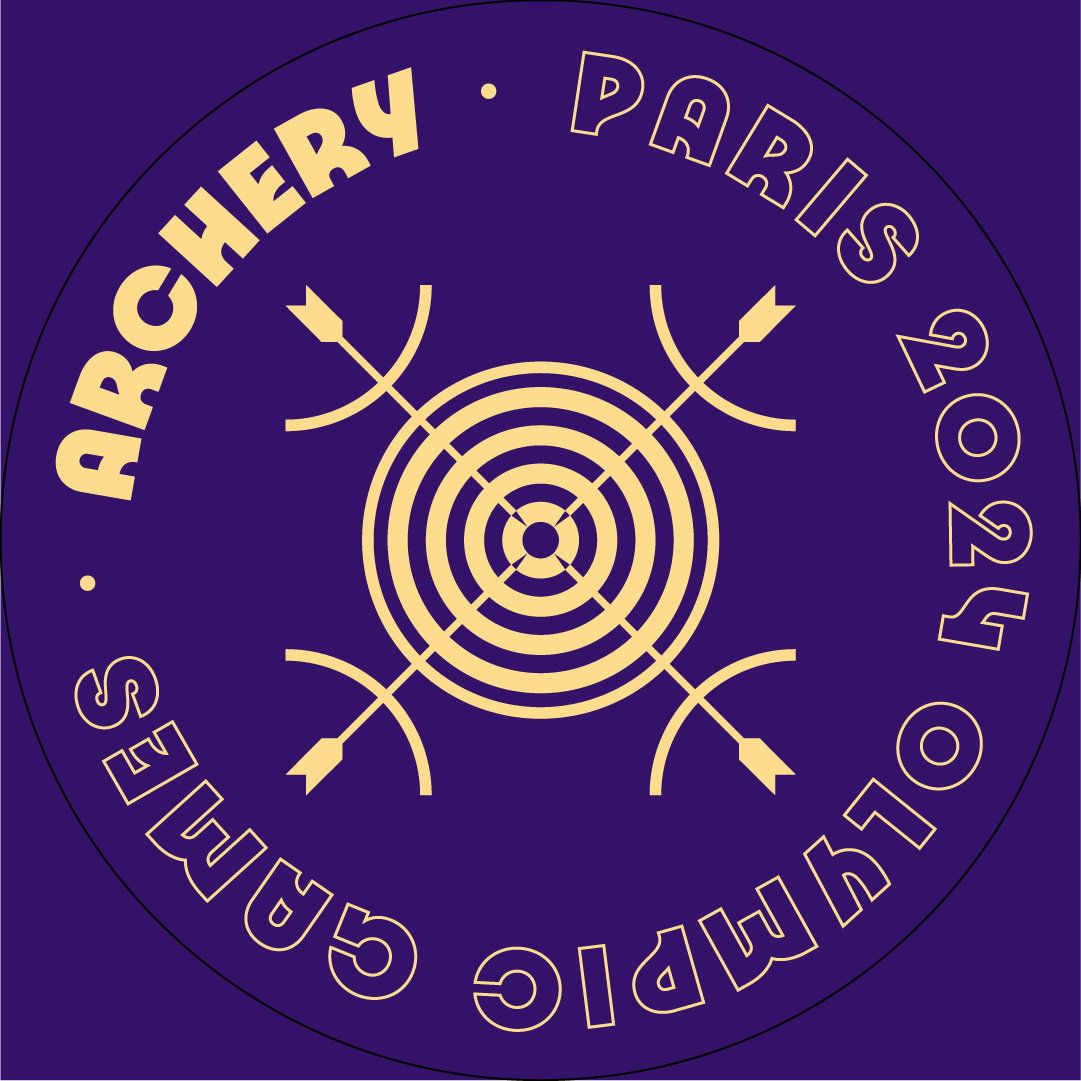
Anyway, the pictograms. They are apparently to be referred to as “blazons” (which translates directly as ‘coats of arms’) and compositionally they resemble a coat of arms and act as ‘badges of honour’ – whatever that means. Unlike the vast majority of pictograms in Olympic history, there is no figurative representation – no people. Rather, each pictogram is composed of three graphical elements: “an axis of symmetry; a depiction of the ground; and a representation of the sport that it illustrates.” as Creative Review put it. Sometimes the axis is overt, as with archery, and sometimes not.
Le Monde apparently cocked an eyebrow, and in translation, Matikhine revealed a little more:
The new visuals, however, have something to intrigue. Their clarity and their comprehension, first requirements of the device, is questionable.
“Some are less distinctive than others”, recognizes Julie Matikhine, brand director at Paris 2024. “But they help to arouse a form of curiosity. Once we have decoded the coat of arms, we understand it forever... On the side of the athletes, some were also a little disturbed. But they had a feeling of pride to belong to this country which takes things a little differently, like with mascots.“
https://www.lemonde.fr/sport/article/2023/02/08/paris-2024-le-comite-d-organisation-devoile-les-blasons-des-jeux-olympiques-et-paralympiques-qui-remplaceront-les-anciens-pictogrammes_6160992_3242.html
The mascots are terrible, but then they always are. More alarming is the need to ‘decode’. Why does the public have to decode it? (Hope I’ve translated that right). And she kind of admits that some aren’t very good? And the athletes didn’t like them?
Let’s look at what they have done for archery.
This is the full logo in it’s ‘digital square’ format with the fruitily retro and playful deco-ish sans-serif font that I like a lot. There is also a handy circular version for your socials. Very thoughtful.
Helpfully, Paris 2024 chose the archery pictogram to break down how it has put them together:
Overall, I’m quite enjoying the archery one, but ‘our thing’ has been one of the easier design challenges for Olympic pictogram designers over the decades. Pointy thing, round thing, curvy thing, someone pulling a bow back. Done. Everyone knows what it looks like. Trying to cram in the five sports of the quadrennial Olympic afterthought that is modern pentathlon? Much more tricky. It does indeed look like a coat of arms. I like the multitude of rings, which adds a kind of historic inexactitude, such as hinted at on this pretty design from the retro-minded BDDW Club. (Read more about them here).
So the designers have essentially exchanged the instant recognition of oh right that’s basketball innit for a more abstract shorthand that will no doubt look better on posters and in TV trails. They also clearly don’t work at small sizes, which is usually a key design constraint.
The problem is, that according to my dictionary, and the Olympic tradition…. these aren’t actually pictograms. This was indeed confirmed at the launch by Paris 2024 president Tony Estanguet, who said this: “Not so much a pictogram as a blazon, a coat of arms, so that we can all be proud of the sports we are hosting.” Righto.
They are better seen as design elements, elements for a wider branding, with a little hint of the individual sport thrown in.
WHERE’S THE PARA LOGO?
There isn’t one. Unlike for the last four pairs of Games, Paralympic archery shares the same pictogram with the Olympics. There is no separate pictogram for para-archery – as there was in Beijing, London, Rio and Tokyo. A total of eight para-sports share the same pictogram with their Olympic cousins. No one has decided to explain why. Perhaps they got stuck, or ran out of time. It happens.
This doesn’t seem consistently applied. For example, track cycling (Olympics) and track cycling (Paralympics) have separate pictograms, with the para version showing the tandem bikes which are now only used in VI cycling – most of the events are on regular/modified bikes. That doesn’t seem too distinctively or iconically different, but OK.
There’s been a suggestion that reusing the logos is a nod towards reducing the costs and complexity of the Games. That’s all good, but as a design exercise, it’s strange and clunky.
OK, so archery kinda works. What about the others?
THE GOOD
A wider problem with the Paris pictograms is that some clearly work vastly better than others as an artistic and representative exercise. They career about between representation, abstraction, and dynamism. The human brain will always try to see patterns and representation. It’s what helps us make sense of the world.
The more traditional one for badminton manages to combine the axis idea with a bit of wit and energy, and maybe a slight nod to constructivism:
The one for breaking, that new and forever controversial addition to Paris 2024, includes a moving record. It’s a little retro for a supposedly modern sport, but it does kinda work. Very 80s.
The pictogram for swimming, with its ripples and its costumes continues the playful, French, and feminine themes already established elsewhere, and it brings across an essence of water and movement. Yeah, that’s good.
THE NOT SO GOOD
The boxing one, which kinda borrows an element from the 1968 set for the Mexico Olympics, doesn’t say boxing nearly as neatly as its multiple predecessors, which use either the gloves or more commonly a little stick-man pugilist. There’s an odd collision of styles, a bit like a robot’s bloodshot eye with a 1960s Batman cartoon fight happening in front. Hmmm. But it gets worse.
The skateboarding one is just weird. It looks like a Freemasonic symbol that someone has tried to put a couple of sticking plasters over.
Shooting? I’d say that was sailing if you asked me. In this case, the representative symbol has trumped the symmetrical construction, for me at least. (I’d guess that some committee was probably paranoid about having a representation of a gun on there, like most of its picto-predecessors, but pent includes one). Compared to the others, it lacks energy. Weak.
But the worst one of all the major sports is artistic gymnastics. You can see what they’ve tried to do – cram in floor and beam and so on, but it doesn’t really work as an abstraction and it’s ghastly as a representation. There’s one beam out there in that arena – not two. The rings aren’t set up like that, pal, that bit looks like an unfinished Olympic logo.
But the beams-as-a-frame make it look like something; a brutalist football stadium, or a Chinese puzzle box, or something else. It doesn’t say ‘gymnastics’. It doesn’t say anything about the essence of gymnastics. It doesn’t look like a coat of arms. It looks like a first attempt. It’s just not good enough.
To be fair, it’s difficult to make all 47 pictograms brilliant. Some sports will always be harder than others to make it work. And because there is more of a focus on the athletes rather than the sports these days, in our personality-driven age of TV packageable sports, I was sure that the little figurative stick man pictograms we’re all so used to and able to relate to would be around forever.
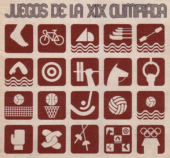
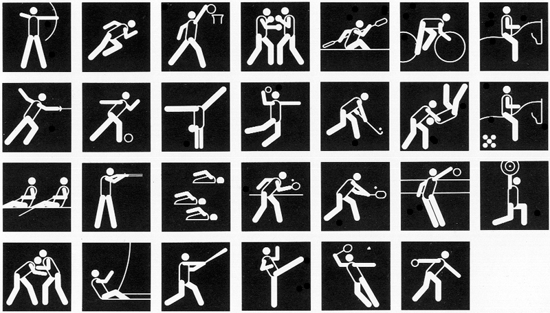
Unfortunately, a set concentrating on the sports has been done, utterly brilliantly, more than half a century ago in Mexico. The designs for 1968 remain the reference work, and none of these symmetrical Parisian gadabouts come remotely close:
Just look at them. The clarity. The economy. The haiku-like simplicity. The beautiful soft colours. The reused design elements. Childlike, but in the best way, with that sense of endlessness. It’s just perfect. It’s never been surpassed. It probably never will be.
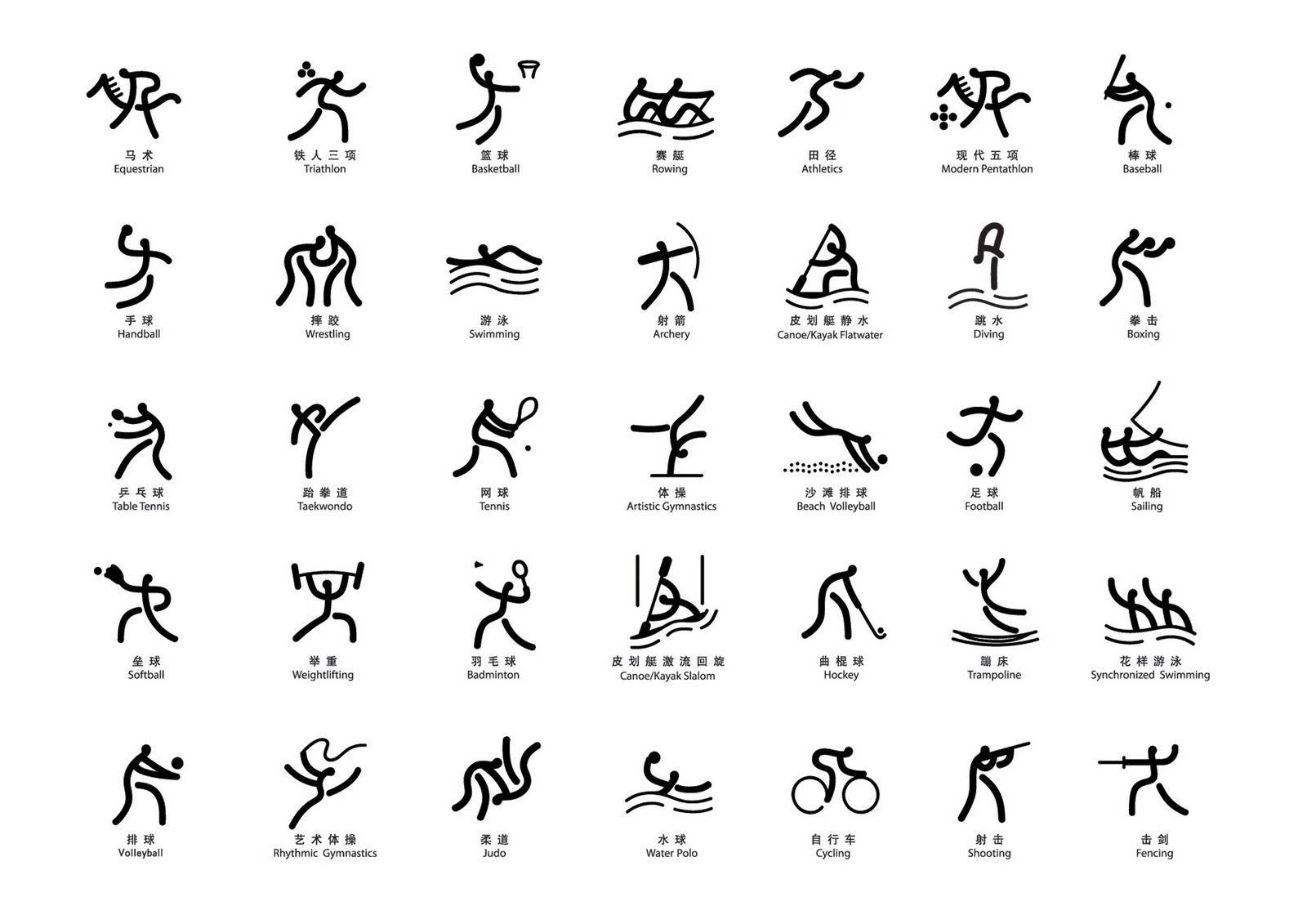
(The soft, chewy squares of Mexico inspired this jelly-babies set from the Youth Olympic Games in Buenos Aires, created by schoolchildren, which I also love for its playfulness and joie-de-vivre – a French quality notably missing from the Paris branding so far. For all the focus on youth at the IOC, this is a stern, adult take.)
The Mexico pictograms were essentially made by a handful of people in a room, and then apparently just delivered to the printers. They weren’t pushed through the grimbong of design competitions, matey contractual arrangements and endless committees. They weren’t subject to the back-and-forthing between international federations and broadcasting and myriad competing demands that the Greatest Show On Earth now asks.
So we have a good pictogram for archery, and a lot of rubbish ones for many other sports. Oh well. The Paralympic pictograms have apparently been given almost no thought at all, with several apparently getting the design brief ‘do the Olympic coat-of-arms thing but shoehorn a wheelchair in there. Yeah, one, two, doesn’t matter.’ Confused and messy.

Overall, I get the attitude though. The thing is, the entire premise was getting stale. The little stick men have pulled their shift, we don’t need them quite as much, let’s do something different. Let’s do something radical. Great. I’m actually all for radical.
After the relatively conservative and sedentary designs for Tokyo, which took almost no risks whatsoever – especially after a logo debacle so catastrophic that no-one could quite believe a country like Japan could have even produced it – pushing the concept a bit further and doing something more modern and abstract was a good call.
However, I’m not so sure the execution of this idea has been pushed hard enough. At small sizes and collectively, they just look like a baffling mess of squished insects.
At full size they act like a coat of arms should; sitting on the wall, stuck in time. They don’t sing. They don’t move. That’s not what sport is about.
Is each individual design really the best it could be? Has the whole concept been iterated, slept on, interrogated? Why isn’t it hitting me in the gut and saying: this, this is right ? So many of them look like the first thing that came to mind (I did wonder if they’d done it alphabetically, spent a few days getting archery right, working their way through, and wrestling got ten minutes the night before the deadline.)
It’s not been detailed yet, but perhaps this designs will look better in video, in live graphics, transformed, reconstructed, whatever. Perhaps something more interesting is to come. For me, it won’t be dethroning Mexico ’68 from my pictogram top-of-the-pops this time.
________________________________________________________


